Accurate.
Legible.
Sharp.
Finance presentation design
The numbers are right. The problem is nobody can see what they mean.
Finance presentation design that makes the story in the data obvious without changing a figure.
Financial presentations fail in a particular way. The data is accurate, the analysis is sound, and then it’s all poured onto slides as tables nobody can read and charts that show everything except the point. The room squints, loses the thread, and the one number that should change a decision sits unnoticed in row fourteen.
Finance presentation design is the fix, and it’s a design problem, not an accounting one. I take your figures exactly as they are and design them so the meaning is immediate: the trend that matters drawn so it can’t be missed, the comparison framed so it lands, the detail there for those who want it without burying those who don’t. I’m a designer, so I never touch your numbers, I make them legible.
You work with me directly, so the way the data’s presented matches how your audience actually needs to read it.






Working on something important?
Chances are I've already designed for someone you compete with.
Making financial data do its job
Charts that make a point, not just plot the data
A finance team came to me with a quarterly board pack that was technically complete and practically unreadable, every chart showing all the data and therefore none of the message. I didn’t change a figure. I rebuilt each chart to answer the question the board was actually asking, stripped the decoration, and gave the headline number the prominence it warranted. Same data, suddenly legible. The board spent the meeting deciding rather than deciphering.
Detail for those who want it, clarity for everyone
Financial audiences are split: some want the headline, some want every line. Good finance design serves both without compromising either, the clear top-line view that lands in seconds, the supporting detail structured so the people who need it can find it without it cluttering the page. That balance is most of the craft, and it’s what turns a dense pack into something a room can actually use. If your numbers are solid but your slides aren’t doing them justice, send them over and I’ll show you the difference.
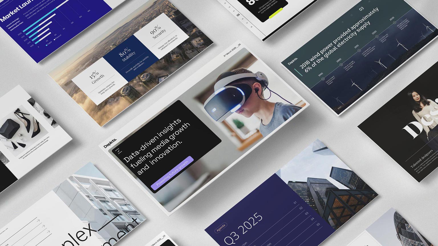
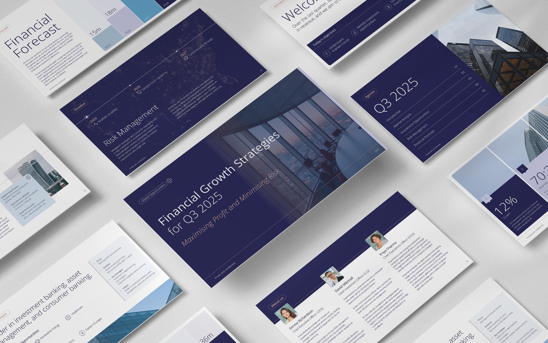
Bespoke presentations showcasing clear financial data to visually striking graphics.
Presentation design built around what your audience needs to see, hear and remember.
Explore my custom finance presentation design work examples
A selection of finance presentation work I’ve designed across sectors and styles, from corporate to creative. Most of my client work is under NDA, so these are here to show what’s possible.